

 收藏人数:
收藏人数:
 购买源码授权版(
 导入插件并试用
 赞赏(0)
赞赏(0)
更新记录
1.0.0(2024-03-18)
初次发布
平台兼容性
云端兼容性
| 阿里云 | 腾讯云 | 支付宝云 |
|---|---|---|
| √ | √ | √ |
uni-app
| Vue2 | Vue3 | Chrome | Safari | app-vue | app-nvue | Android | iOS | 鸿蒙 |
|---|---|---|---|---|---|---|---|---|
| √ | - | √ | √ | √ | - | - | - | - |
| 微信小程序 | 支付宝小程序 | 抖音小程序 | 百度小程序 | 快手小程序 | 京东小程序 | 鸿蒙元服务 | QQ小程序 | 飞书小程序 | 小红书小程序 | 快应用-华为 | 快应用-联盟 |
|---|---|---|---|---|---|---|---|---|---|---|---|
| √ | √ | - | - | - | - | - | - | - | - | - | - |
其他
| 多语言 | 暗黑模式 | 宽屏模式 |
|---|---|---|
| × | × | √ |
云函数类插件通用教程
使用云函数类插件的前提是:使用HBuilderX 2.9+
依赖组件:
本组件依赖uni-ui扩展组件,使用前请提前引入uni-config-center、uni-icons、uni-id-common等,详细依赖请查看示例项目
代码示例:
<template>
<view class="container">
<view >
</view>
<view class="filter-bar" >
</view>
<view class="data-list" >
<!-- 角色信息列表 -->
<cxk-cloud-ntable
:tableOpt="{stickSide:false,fontSize:14,textAlign: 'center'}"
:tableHeight="0"
:tableData="roleList"
:columns="columns"
colKey="dataIndex"
idKey="roleId"
:iconsButStyle="['compose','trash-filled']"
:showButton="['edit','delete']"
@editButton="editButton"
@deleteButton="deleteButton"/>
</view>
<view >
</view>
</view>
</template>
<script>
export default {
components: {
},
data() {
return {
//列表展示的字段名
columns: [],
//列表数据
roleList:[],
total: 0, //总条数
}
},
onShow(options) {//监听页面显示,页面每次出现在屏幕上都触发,包括从下级页面点返回露出当前页面
this.getList();
},
onLoad () {
},
created() {
},
mounted() {
//列表展示的字段名
this.columns = [
{
"title": "编号",
"dataIndex": "roleId" ,
},
{
"title": "角色名称",
"dataIndex": "roleName" ,
},
{
"title": "操作",
"dataIndex": "roleId",
"width": 120
}
]
},
methods: {
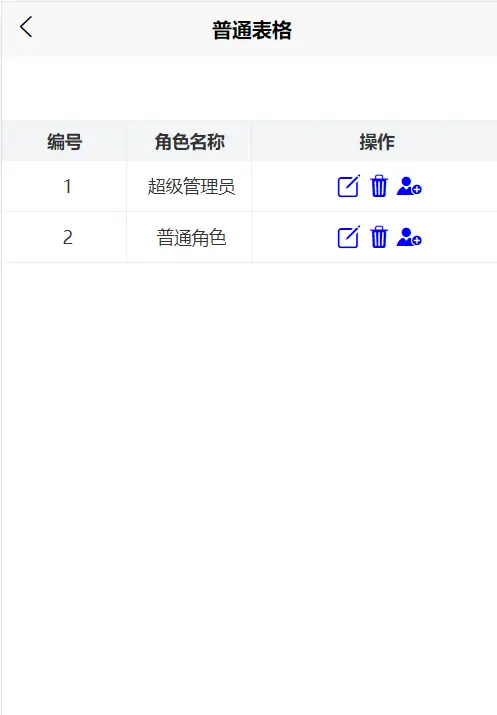
/** 查询角色信息列表 */
getList() {
const db = uniCloud.database() //代码块为cdb
db.collection("role").field("_id as roleId,name as roleName").get()
.then((res) => {
const resdata = res.result.data
this.roleList = resdata;
console.log("resdata", resdata);
}).catch((err) => {
uni.showModal({
content: err.message || '请求服务失败',
showCancel: false
})
}).finally(() => {
})
},
//编辑
editButton(row,col){
alert(row,col)
},
//删除
deleteButton(row,col){
alert(row,col)
},
}
}
</script>
<style>
page{
height: 100%;
}
.container{
height: 100%;
display: flex;
flex-direction: column;
}
.filter-bar{
/* height: 100rpx; */
display: flex;
justify-content: space-between;
align-items: center;
height: 50px;
background-color: #fff;
border-bottom: 1px solid #eee;
padding: 0 10px;
/* position: sticky; */
}
/* 数据列表样式 */
.data-list{
overflow-y: auto;
flex: 1;
width: 100%;
}
</style>
属性说明
props属性说明:
export default {
    props:{
        // 表格基础配置 ,详细请看本文具体配置
        tableOpt: { type: Object },
        // 数据源唯一key字段名
        idKey: { type: String, default: 'id' },
        // columns中对应列表数据的 字段名(例子中对应dataIndex)
        colKey: { type: String, default: 'key' },
        // 数据源 异步加载可以先传递false
        tableData: { type: [Array, Boolean], default () { return false } },
        // 表头数据
        columns: {type: [Array, Boolean], required: true},
        // 表格高度 不传递或0表示不限制
        tableHeight: {type: [Number, Boolean],default: 0},
        //操作列,启用按钮,可选项(add,delete,edit,custom,custom2),数组值顺序应与iconsButStyle一致
        showButton: {type: [Array, Boolean], required: true},
        //操作列按钮的icons样式,取值为uni-icons图标,数组值顺序应与showButton一致
        iconsButStyle:{type: [Array, Boolean], required: true},
        //添加按钮方法,若showButton中含有add时必填
        addButton:{type: function, required: false},
        //删除按钮方法,若showButton中含有delete时必填
        deleteButton:{type: function, required: false},
        //编辑按钮方法,若showButton中含有edit时必填
        editButton:{type: function, required: false},
        //自定义按钮方法,若showButton中含有custom时必填
        customButton:{type: function, required: false},
        //自定义按钮方法,若showButton中含有custom2时必填
        customButton2:{type: function, required: false}
    }
}
tableOpt属性取值:
// 表格整体配置
export const tableOpt = {
    // textAlign String | 内容对齐方式 left center right
    textAlign: 'center',
    // fontSize Number | 字体大小
    // 数字类型,单位 px [v1.1.1]调整
    fontSize: 12,
    // color String | 字体颜色
    // 优先级 : 相对columns[item] -> item.bodyColor 低
    color: "#333",
    // emptyText String | 空数据显示的文字内容
    emptyText: '暂无数据',
    // isShowSum Boolean | 是否显示底部统计 默认不显示
    isShowSum: false,
    // stickSide Boolean | 是否固定左侧侧首栏 默认固定
    stickSide: true,
    // sumPlace String | 合计行位置 top / bottom, 仅 isShowSum = true 生效
    sumPlace: 'bottom',
    // borderLeft Boolean | 是否显示竖向边框
    borderLeft: true,
    // borderBottom Boolean | 是否显示竖向边框
    borderBottom: true,
    // borderColor String | 边框颜色
    borderColor: '#f5f5f5'
}
注意:
1,先将根目录下的uniCloud/database下的数据库文件初始化到云端,让云端产生数据;
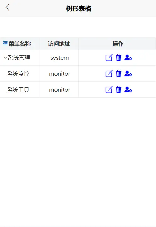
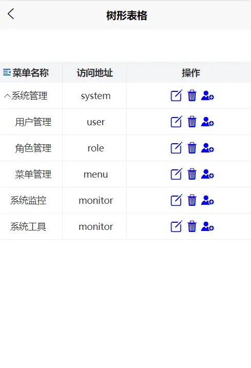
2,表格数据中正确包含children节点,就会自动以树形表格展示
 下载 209
 赞赏 0
赞赏 0

 下载 34692
 赞赏 156


 赞赏
赞赏
 京公网安备:11010802035340号