


 收藏人数:
收藏人数:
 下载插件并导入HBuilderX
 下载示例项目ZIP
 赞赏(0)
赞赏(0)
更新记录
1.01(2020-12-17) 下载此版本
适用与app和pc端
- 可以设置
图标圆角圆形朴素 - 增强
文字按钮是不同类型有对应的文字按钮颜色 - 可以为按钮设置
icon,支持element-ui的图标 - 可以设置按钮尺寸(
app推荐使用默认尺寸或者使用小尺寸的文字按钮)
1.0(2020-12-17) 下载此版本
使用element-ui样式,在uniapp上实现el-button
- 支持element-ui多数属性,不支持
autofocusnative-type - 丰富按钮为
文字时,文字颜色
平台兼容性
前准备
1.使用 easycom模式
    "easycom": {
        "autoscan": true,
        "custom": {
            "^el-(.*)": "@/components/el-$1/el-$1.vue"
        }
}2.在App.vue中引入css文件
<style>
    @import '@/static/scss/element-ui.css';
</style>
3.文件目录清单
|- components
|-- el-button
|--- el-button.vue //组件文件,可以进行修改和拓展
|--- el-button.md //说明文件
|--- el-button-app.gif //app效果图
|--- el-button-pc.gif //pc效果图
|- static
|-- fonts //element-ui样式中使用的字体文件
|--- element-icons.ttf
|--- element-icons.woff
|-- scss //css和scss样式文件
|--- element-ui.css
用法示例
<view class="content">
<view class="p10 tip-s m-t10">
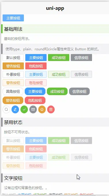
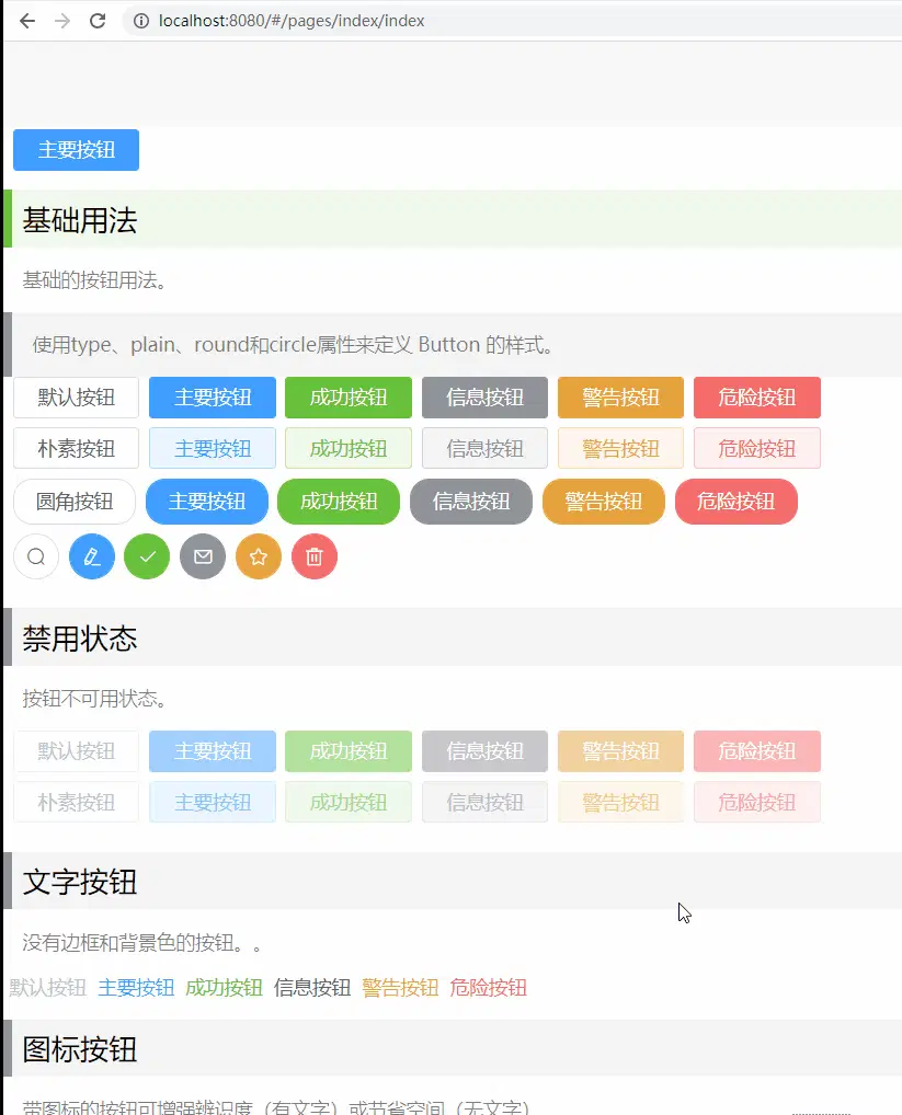
基础用法
</view>
<view class="text">基础的按钮用法。</view>
<view class="tip-i text">
使用`type`、`plain`、`round`和`circle`属性来定义 Button 的样式。
</view>
<view class="item f-s-w">
<el-button>默认按钮</el-button>
<el-button type="primary">主要按钮</el-button>
<el-button type="success">成功按钮</el-button>
<el-button type="info">信息按钮</el-button>
<el-button type="warning">警告按钮</el-button>
<el-button type="danger">危险按钮</el-button>
</view>
<view class="item f-s-w">
<el-button plain>朴素按钮 </el-button>
<el-button type="primary" plain>主要按钮</el-button>
<el-button type="success" plain>成功按钮</el-button>
<el-button type="info" plain>信息按钮</el-button>
<el-button type="warning" plain>警告按钮</el-button>
<el-button type="danger" plain>危险按钮</el-button>
</view>
<view class="item f-s-w">
<el-button round>圆角按钮</el-button>
<el-button type="primary" round>主要按钮</el-button>
<el-button type="success" round>成功按钮</el-button>
<el-button type="info" round>信息按钮</el-button>
<el-button type="warning" round>警告按钮</el-button>
<el-button type="danger" round>危险按钮</el-button>
</view>
<view class="item f-s-w">
<el-button icon="el-icon-search" circle></el-button>
<el-button type="primary" icon="el-icon-edit" circle></el-button>
<el-button type="success" icon="el-icon-check" circle></el-button>
<el-button type="info" icon="el-icon-message" circle></el-button>
<el-button type="warning" icon="el-icon-star-off" circle></el-button>
<el-button type="danger" icon="el-icon-delete" circle></el-button>
</view>
<view class="p10 tip-i m-t10">
禁用状态
</view>
<view class="text">按钮不可用状态。`disabled`</view>
<view class="item f-s-w">
<el-button disabled>默认按钮</el-button>
<el-button type="primary" disabled>主要按钮</el-button>
<el-button type="success" disabled>成功按钮</el-button>
<el-button type="info" disabled>信息按钮</el-button>
<el-button type="warning" disabled>警告按钮</el-button>
<el-button type="danger" disabled>危险按钮</el-button>
</view>
<view class="item f-s-w">
<el-button plain disabled>朴素按钮</el-button>
<el-button type="primary" plain disabled>主要按钮</el-button>
<el-button type="success" plain disabled>成功按钮</el-button>
<el-button type="info" plain disabled>信息按钮</el-button>
<el-button type="warning" plain disabled>警告按钮</el-button>
<el-button type="danger" plain disabled>危险按钮</el-button>
</view>
<view class="p10 tip-i m-t10">文字按钮`is-text`</view>
<view class="text">没有边框和背景色的按钮。。</view>
<view class="item f-s-w">
<el-button disabled is-text>默认按钮</el-button>
<el-button type="primary" is-text>主要按钮</el-button>
<el-button type="success" is-text>成功按钮</el-button>
<el-button type="info" is-text>信息按钮</el-button>
<el-button type="warning" is-text>警告按钮</el-button>
<el-button type="danger" is-text>危险按钮</el-button>
</view>
<view class="p10 tip-i m-t10">图标按钮`icon`</view>
<view class="text">带图标的按钮可增强辨识度(有文字)或节省空间(无文字)。</view>
<view class="item f-s-w">
<el-button type="primary" icon="el-icon-edit"></el-button>
<el-button type="primary" icon="el-icon-share"></el-button>
<el-button type="primary" icon="el-icon-delete"></el-button>
<el-button type="primary" icon="el-icon-search">搜索</el-button>
<el-button type="primary">上传<i class="el-icon-upload el-icon--right"></i></el-button>
</view>
<view class="p10 tip-i m-t10">加载中`loading`</view>
<view class="text">点击按钮后进行数据加载操作,在按钮上显示加载状态。</view>
<el-button type="primary" :loading="true">加载中</el-button>
<view class="p10 tip-i m-t10">不同尺寸`size`</view>
<view class="text">
Button 组件提供除了默认值以外的三种尺寸,可以在不同场景下选择合适的按钮尺寸。
<view class="tip-d">
除了默认尺寸外,其他尺寸并不建议使用
</view>
</view>
<view class="item f-s-w align-items-center">
<el-button>默认按钮</el-button>
<el-button size="medium">中等按钮</el-button>
<el-button size="small">小型按钮</el-button>
<el-button size="mini">超小按钮</el-button>
</view>
<view class="item f-s-w align-items-center">
<el-button round>默认按钮</el-button>
<el-button size="medium" round>中等按钮</el-button>
<el-button size="small" round>小型按钮</el-button>
<el-button size="mini" round>超小按钮</el-button>
</view>
<br />
<br />
<br />
</view>
参数说明
| 参数 | 说明 | 类型 | 可选值 | 默认值 |
|---|---|---|---|---|
| size | 尺寸 | string | medium / small / mini | — |
| type | 类型 | string | primary / success / warning / danger / info | — |
| plain | 是否朴素按钮 | boolean | — | false |
| round | 是否圆角按钮 | boolean | — | false |
| circle | 是否圆形按钮 | boolean | — | false |
isText |
是否文字按钮,当为true,会根据type显示不同的按钮颜色 |
boolean | — | false |
| loading | 是否加载中状态 | boolean | — | false |
| disabled | 是否禁用状态 | boolean | — | false |
| icon | 图标类名 | string | — | — |
 下载 1244
 赞赏 0
赞赏 0

 下载 12286133
 赞赏 1922


 赞赏
赞赏
 京公网安备:11010802035340号